Search This Blog

Saturday, August 31, 2024

That 3D "Book Cover" Embossed Card, Again...


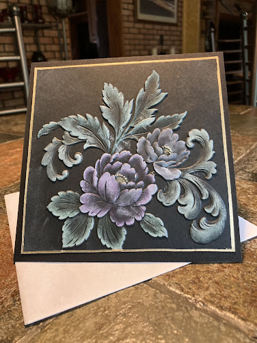
As my husband pointed out, I "must really love that folder!" And I have to admit, I do as well as all the other beautiful and interesting 3D designs. 

This time I did a photo study. First, use a White Dye Ink to highlight the raised design. I prefer to let that dry before adding the color. However, you can work while the white is still wet and get great results. As you may notice, I used the Altenew Crisp Dye Inks. I think the following photos will make this easier to follow.


Again, instead of using a brush applicator, I decided upon the eyeshadow applicator. I  prefer to use the flat side, tapped onto the color several times before lightly blending using slight circular strokes. It may take 2-4 applications to achieve the look you desire.

**********************************

I'd like to wish all of you a fantastic upcoming September. Ours will be busy so I may not be on again until October. So, please, have a great few weeks creating and remember - Christmas is coming!

Always, Barb 

May God Bless all of you.


Friday, August 16, 2024

3-Dimensional Peony Cards – Different Finishes


My thoughts: Dimensional folders have been around for a long time in our card crafting world. Originally, we called them embossing folders. The embossed pieces had a nice, slightly raised image and became a favorite “background” for our embellishments and sentiments. That design added a more professional look to our card creations and we received the admiration of the recipients. As technology advanced, the embossed designs became more intricate and with a more highly raised impression. Today, there are hundreds (or more) wonderful 3-D folders to select from...

Today’s projects are using the Altenew’s “Book Cover Engraving 3-D” folder. The technique for both cards start out the same but are completed a little different (at least, different for me).

Rough instructions: I really enjoy doing my 3-Ds with the darker pearlescent papers – black is my preference but I used a deep purple for the other card front.

Highlight design: For both projects, I used Hero Arts’ Hero Hues White. Two – four light applications to just the raised designs. The white might fade somewhat but do not let the worry you.

For the one on black: I decided to use an eyeshadow applicator to apply the colorations. Using the flat side of the applicator to LIGHTLY apply the colors. I found by using a circular type of blending worked for me. Let the color dry a few minutes before doing the next layer – some areas took 3 applications. … Colors used: Versa Color: 61 Olive, 161 Green Tea, 69 Bamboo, 60 Celadon, 182 Bisque, 52 Topaz, and 56 Cinnamon. Let the color dry than, if you wish, apply a spry sealer.


For the one on purple: This was started just as the other by highlighting the raised design with white. Using the same type of eyeshadow applicator, I applied several applications of Brilliance’s Galaxy Gold. When the gold dries – lightly buff with a tissue.


Thank you for dropping by today – hope your creative creations are exactly as you dreamed, and you are having fun.

Till next time – God Bless!