Arteza
Watercolor Pencils vs Chameleon Alcohol Pens
Applied
to
Sift
Finish Cardstock vs Watercolor (90 lb. cold press) Paper


First Test:
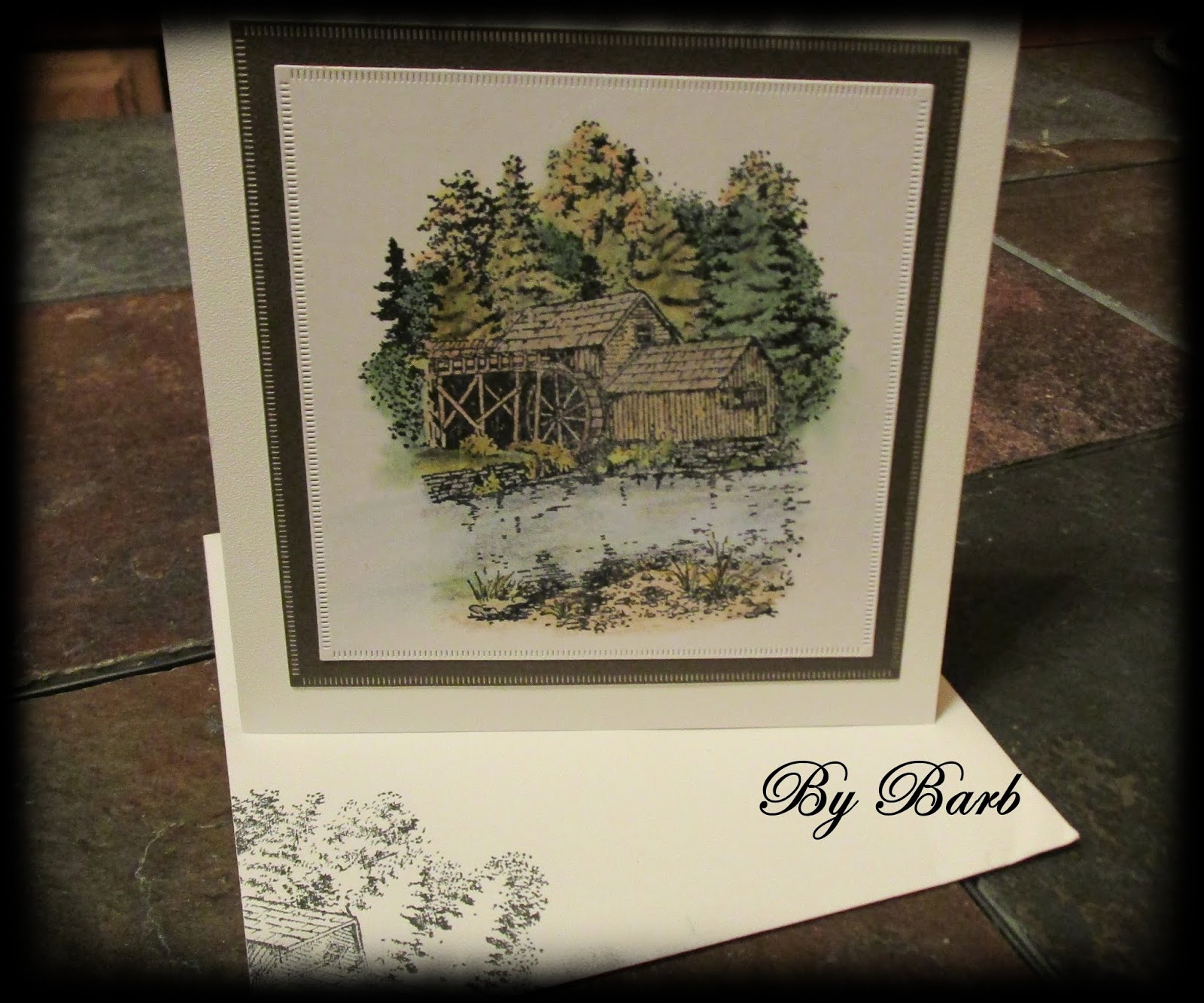
Elizabeth Craft Design – Soft Finish
-White Cardstock
Whimsy Stamps – Dove Art – Himalayan
poppy
Paper: My
1st goal was to see how the Soft Finish cardstock would hold up with
all the water that would be applied. I
went over some of the portions of the design multiple times with the color and
water. When wet, it did not warp. There are a few dimples on the backside but
once mounted, they will not show. I’m impressed and recommend you give it a try.
Soft Finish
using Arteza: Used a generic water-brush

A024 White Quartz
A052 Pumpkin
A070 Blueberry
A075 Ivory
A094 Emerald
A111 Coyote
Arteza:
This was my first time to use Watercolor Pencils in a very long time. For the
last 10 years or more, I basically used my Prismacolor pencils (bought almost
13 years ago) and a blending nub in order to achieve the desired appearance.
However, after watching Sandy Parker’s video and several other non-company
artists, it was time to expand my creative directions.
I really must admit that I love my
results. I could go on about the packaging, the pencil shapes, the clearness
for the identifying names, but you have probably heard it all. As for
performance, especially on this slightly textured surface, it was exciting. I
applied a light pressure to the surface and was pleased with the water
blending. I used a little more pressure on the wet area then blended again with
the water-brush.

Bl6 Royal Blue
OL3 Olive Green
YO3 Warm Sunset
CG8 Cool Gray
Chameleon
Alcohol Pens: If you have followed my blog, you know that I totally enjoy us
these alcohol pens. They work great wherever I apply them – every type, texture
or thickness of paper plus great on Foamiran. Happily, there were no problems
with this Soft Finish cardstock.
I infused the Royal Blue to between a 5 and 10 count for the lighter areas and of course full strength for the darker. Like most of the papers I’ve tried, the alcohol does bleed through but with no textural distortion.
I infused the Royal Blue to between a 5 and 10 count for the lighter areas and of course full strength for the darker. Like most of the papers I’ve tried, the alcohol does bleed through but with no textural distortion.
Second
Text:
Canson
– Watercolor Paper (cold press) 90 lb. – Aquarelle
Gina
K Stamps – Rose Bouquet
Arteza
Watercolor Pencils vs Chameleon Alcohol Pens
Paper:
My 2nd challenge was to see how the Canson
Cold Press Watercolor Paper withstood the use of a WC
pencils with a heavy water application and the alcohol ink. As I said earlier, it
has been a long time since I enjoyed the benefits of watercolor.
If
interested, there is an excellent article regarding the types of papers that I
thought you might enjoy: https://watercoloraffair.com/cold-press-vs-hot-press-watercolor-paper-heres-how-to-choose/.
Cold
Press using Arteza:

A029 Moss
A052
Pumpkin
A064
Yellow Ochre
A100 Pear
A111
Coyote
Arteza: I
wanted to use the same application technique as I did with the Soft Finish
paper. I did a little extra water blending and occasionally blotted the surface
when I felt it was getting too wet. I have used this paper weight with other
types of watercolor but because of the WC pencil applications and extra water,
the paper warped a little more than I wanted. I will try this again with a
140-300 lb. surface.
Because of the texture (unevenness) of the
paper, the watercolor pencil has a softer, gentle appearance. Perfect for so
many of our celebration cards.
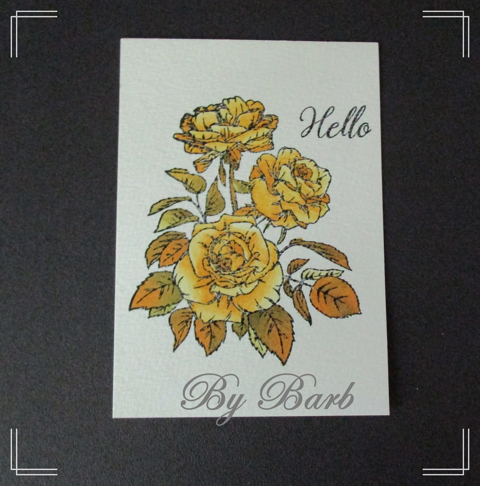
Cold Press using Chameleon Color Tones:
OL3 Olive Green
YO3 Warm Sunset
Chameleon Color Tops:
YO3 Warm Sunset
Chameleon: Again,
I followed my same application technique. However, if you notice I only used two
colors for the entire project. Using the infuser with the Warm Sunset do a 5-8 count. Reapply full strength for
the more intense Warm Sunset. The leaves were infused with the Warm Sunset onto
the Olive Green. I’m really impressed with this appearance.
MY RESULTS: This
was a fun project. I learned a great deal about both types of surfaces and the color
applications. Do I have a favorite? I can’t really say. Love both.
Thank you for stopping by today. Hope this might help
when thinking about the next card on your list. Now for me, it’s to complete
the projects.
Till next time … God Bless Each of You.